Mobirise
Anthony Armstrong
UX/UI Designer, & Sound Designer

Anthony Armstrong is a self-published game developer, with focus in UX/UI design, sound design, and overall game development, currently employed as a UI Integrator/Tech Artist at Ubisoft Toronto.

In 2018, Anthony graduated from Toronto Film School with honors, having completed two capstone games, with one, Project Vanish, winning awards at the 2018 Festival of Films. Later, going on to obtain a BBA in Project management, gaining a deeper understanding of the development lifecycle and Agile projects using SCRUM & KANBAN.

Anthony developed and produced solo projects and collaborations with other small studios, like indie studio Idea Muscle, working primarily as a consultant and UX/UI Designer, through his indie studio, Green Army Games.

 "I love paying attention to the finer details of games, how they flow from title to finish, how they sound, and all the ways developers speak through the art they make. I've been a musician, a soldier, a fine dining server, and a laborer, which gave me a unique toolset for game design, and I love putting those tools to work!"
- Anthony Armstrong

Find my resume here

Projects

Unannounced FarCry Project 
-  UI Integrator/Tech Artist

While I am under an NDA, I can state my role involves work on the implementation of map systems, menus, UI audio, HUD systems, in-game icons and compass systems, notifications and objective tracking, and manipulation of game objects in the UI, through a combination of visual scripting and engine tools. 

This role involved a lot of self-learning, interdisciplinary collaboration, and team communication. This was especially true working in a multi-studio project, including Ubisoft Kyiv.  

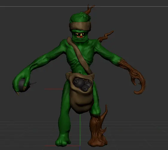
Goblin 3D model

More Info:
Facebook
Instagram

Unannounced VR Game
- Idea Muscle Inc.

Primarily served as a business, marketing, and UX design consultant during the early stages of development, helping the team to build proper project pipelines, UX flows, documentation, and high level project plans. Currently under NDA

Mobirise

Click here to download the demo

Project Vanish
- Sound Designer/UI Integrator

A PC based Sci-fi superhero stealth game set in a moon base in the future. In Collaboration with indie studio, New Horizons

I was brought onto this project as the Lead Sound Designer, responsible for planning, sourcing, creating, and editing all the SFX, music loops, and ambient tracks for the game. This required working closely with the Design and animation teams.
   Additionally, I filled the roles of UX designer and UI Technical Designer, working with the UI Lead Technical Designer, Creative Director, and Art Team to implement and animate UI assets.

Winner of "Best Graduating Game - 2018," "Best Game," and "Best Male Performance (Live Action) - 2018" Awards at Toronto Film School's Festival of Films.

UX/Sound Demo

Mobirise Website Builder
UI Animation

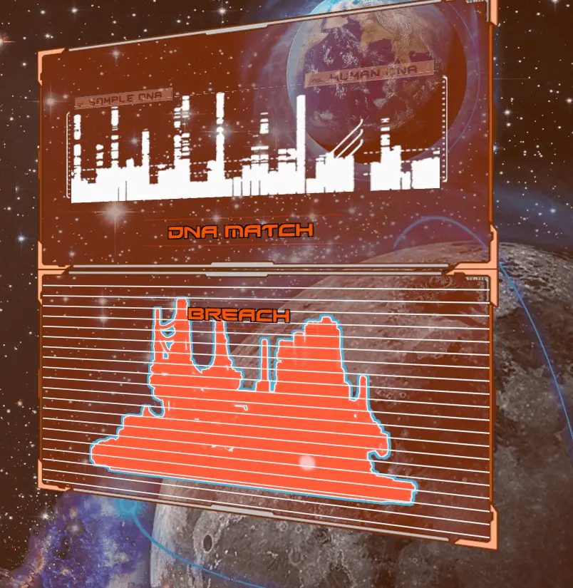
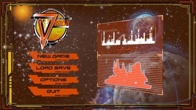
To give the title menu more life, I added animations to these UI elements, giving them more of a retro, sci-fi monitor esthetic, with scanlines and dimming.
Mobirise Website Builder
Animated Buttons

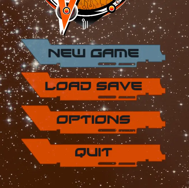
Following the retro, sci-fi esthetic, I decided to add a colour strobe to the buttons, giving them more pop, and a simple digital button sound when clicked or hovered over.
Mobirise Website Builder
Cross Collaboration for Design

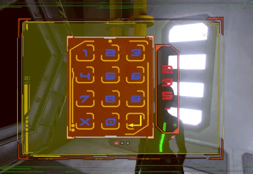
In-game UI assets like this required that I work closely with the UI artists, to ensure each element was exported with the correct dimensions and clipping, and programmers to implement and test functionality.
Mobirise Website Builder
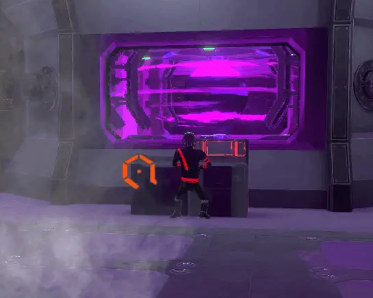
(Royalty Free) Music Time

The music used in the game was initially sourced from online, royalty free, catalogs. I chose tracks that would portray feelings to the player, such as the semi-mysterious, techno title track. In-game, this is used to give a sense of urgency and danger, during chases.
Mobirise Website Builder
Voice Over Lines

Creating and editing the characters' lines took multiple steps, from writing and recording, to editing and adding sound effects. Each character has their own style of effects to apply: Vanish over coms, Aura clean, Silas over PA speakers, and stormtrooper like guards.
Mobirise Website Builder
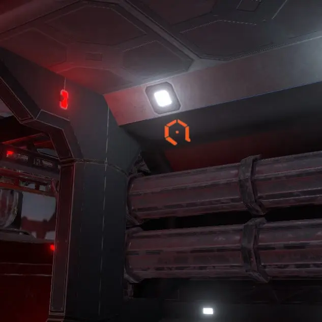
Loving the Ambience

Each area of the game has distinct, hi-fi ambient loops, giving them their own feel, as the player passes from one to the other. For example, the starting area is a pipe lined set of hallways, linked with pneumatic doors. I created a loop of steam pipes with heat pings, the buzz of overhead lighting, and ventilation.
Mobirise Website Builder
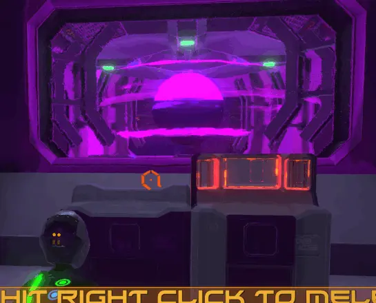
Ambient SFX Add Atmosphere

In addition to the base ambient loops, some areas include static objects with spatial SFX loops, giving areas depth and immersion. Here, I created a SFX for the generator, without having access to the animation, but given a general description of what it would look like. This ended up being my favourite piece.
Mobirise Website Builder
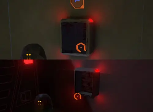
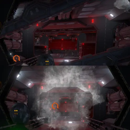
Simple SFX

Some in-game elements, like the Health Box, allowed me to use simple, but layered, SFX. While simple, they still required attention to timing, to match animation keyframes, and accuracy to avoid breaking immersion.
Mobirise Website Builder
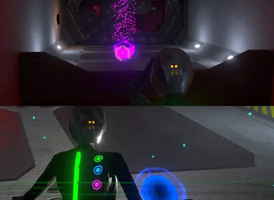
Timing is Everything

Other objects, like elevators and doors required more complex SFX to match animations and immersion. Doors needed two sounds, for open and close, along with hisses matching the steam particle effect, while elevators needed start and stop sounds and a "running" loop, in order to allow for different height elevators.
Mobirise Website Builder
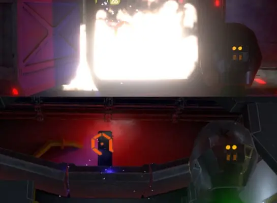
Power Overwhelming

Similar to the interactable objects, Aura's powers each needed a differs style of SFX. For her base attack, I created and energy charging loop, followed by a second loop for the flying energy ball, and finally the impact noise. For the teleport, a simple energy "zap" worked well, while the X-Ray incorporated a sonar ping with a trailing echo.
Mobirise Website Builder
Break Something Tonight!

Some objects in-game require interaction from Aura's powers. This meant ensuring the SFX were loud enough to be heard over ambience and the powers, but not so loud they overwhelm the players. This step took a bit more in-game testing than others, as the only way to know the levels were right was to hear it in action.

Mobirise

Click here to play in a browser window
(support may be limited)

Got-Z-Munchies
- Solo Development (Green Army Games)

This mobile game was entirely designed, developed, and produced by me. Using royalty-free art and audio from various sources, including my own creations, I developed this game for Android and Windows PC, using Unity, and published it to the Google Play Store (currently in closed testing).

A mobile based infinite runner with a twist....you are the last...uh unliving?... zombie on earth, running from hoards of humans in this addicting role-versal runner. Collect brains to unlock new zombies and power-ups, grab weapons to fight the humans and munch on their brains too! Get in there and cure those munchies!

UX/Game Design Demo

Mobirise Website Builder
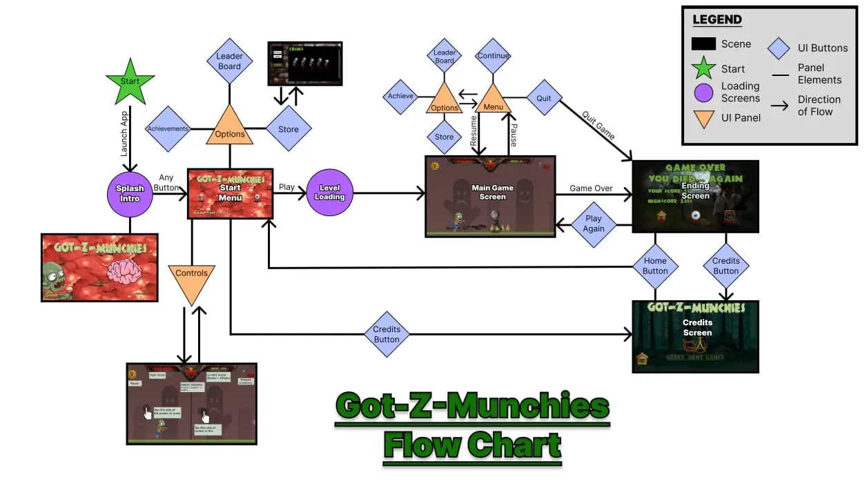
Figma Flow Chart for Got-Z-Munchies
Living UX Design Document

Using FIGMA, I created and update the UX Design flowchart, replacing symbols with mockups, wireframes, and screenshots of final assets as they are added to the project. This allowed me to track functionality, features, and changes, in real-time, and manage project scope/requirements.

Mobirise Website Builder
Animated Title Screen

Rather than having a simple, static title screen, I opted to add in my main character with a goofy animation and zombie groans, to build the games esthetic early on. From here, the game's eerie music begins, adding to the spooky but funny theme of the game.

Figma Flow Chart for Got-Z-Munchies
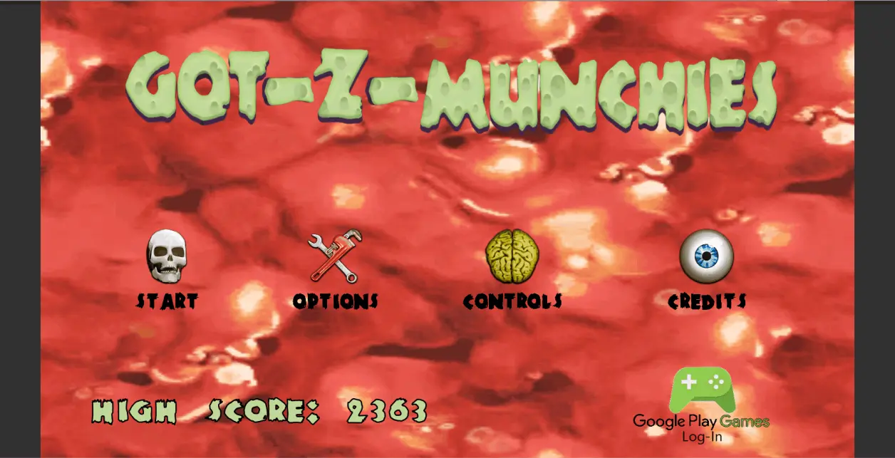
Dynamic Start Menu

For the start menu, I decided to include a High-score display, giving players both a sense of accomplishment and a call-to-action to play more, every time they start the game or return to the menu. I also decided to include a dynamic Google play login button for the mobile version, to give players a visual indicator if the game failed to auto-login. This was done to ensure players could access and use the in-game store properly.

Figma Flow Chart for Got-Z-Munchies
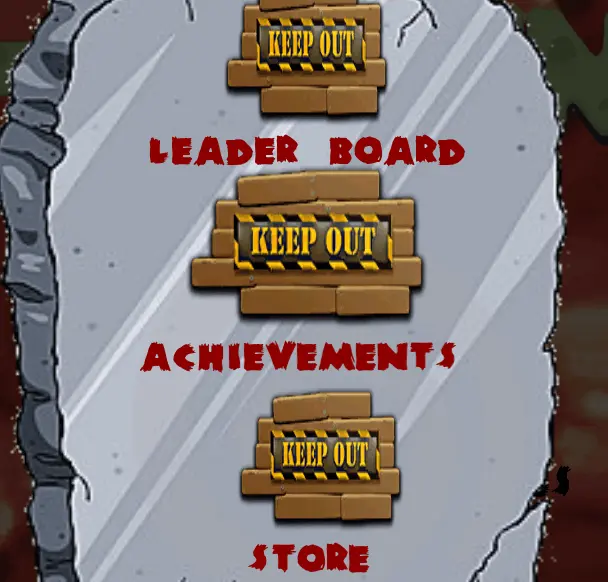
Safety Features in Menu

The options menu, like the Google Play login button, changes based on login status. This ensures that, if the game has failed to auto-login, the player is blocked from accessing the Google Play features and In-App purchasing and has a visual queue to login manually. 

Mobirise Website Builder
Cross-Platform Instruction

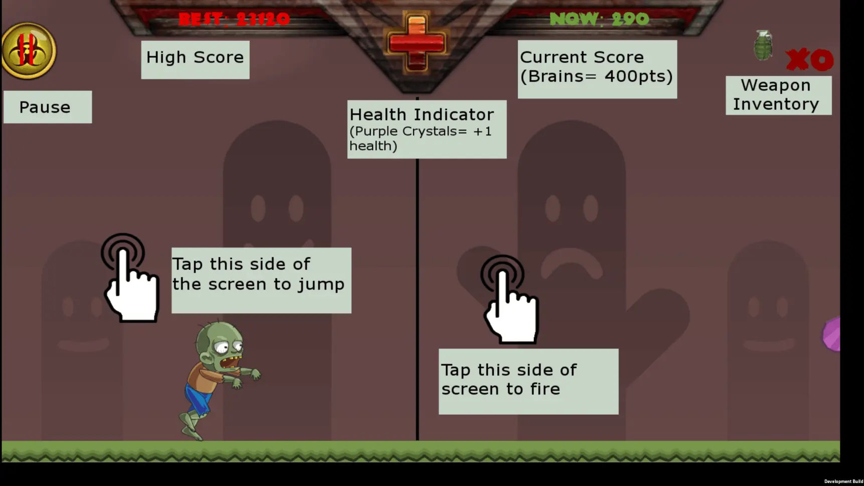
I built the instructions as an image, with coding to switch the image based on platform. This was to ensure a streamlined, user-friendly experience, providing an easy to understand guide, without the need of in-game tutorials. The guide is quickly accessed from the title screen, using the "controls" button.

Mobirise Website Builder
HUD System

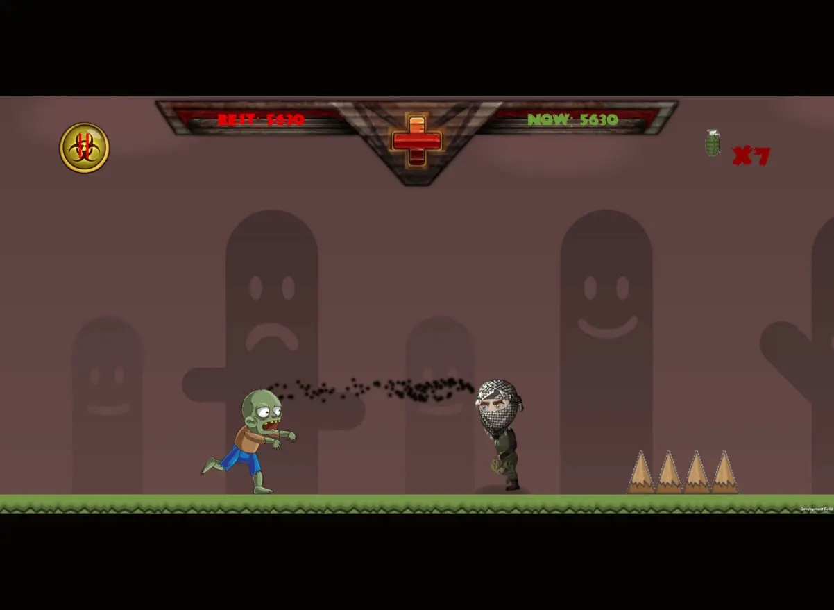
Continuing the pattern of using visual queues, I chose to use a visual health indicator, which dims and empties as player health changes, and placed it in the center of the HUD to draw focus. I've also chosen to keep the "attack" inventory separate from the main HUD elements, in order to stand out as a second focal point, rather than be forgotten while playing. To better draw the player's focus, I've placed the dynamic distance tracking on the right, beside the inventory, with the static "high score" on the left

Trials of the Fallen

Click here to download the demo
*Note: Use "R" to rotate traps and "Enter" to place them, in-game.*

Trials of the Fallen -
UX Lead/Sound Designer

An AR turn-based strategy game for the iPhone. Developed and produced by Dollar Coffee Games.
You are the goddess of death. You must test the soul's of three fallen warriors to judge their worth to enter the Elysian Fields.

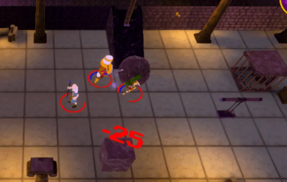
The initial design for this game was concepted by me, then expanded on through collaboration with our Creative Director and team leads. While being developed by our small team of 4 programmers, 5 artists, and 1 graphic designer, many of us took on multiple roles through the evolution of the game.

Personally, after the initial design phase, I took on the roles of Lead UX/UI Designer, Sound Designer, and Project Manager. This project was especially challenging due to a shrinking team size, from over 30 members down to 10, changing platforms from PC to iOS AR, and necessary engine version changes. All-in-all, as the first mobile AR capstone game in Canada, the project was a huge success.

AR Gameplay Trailer

Mobirise Website Builder
3D Title Screen

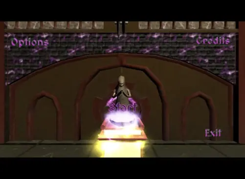
Rather than creating a traditional loading screen, I created this 3D start menu, to give more of a mystical feel. This was a collaboration between myself, our Lead 3D Modeler, and our Lead Technical Artist. The scene utilizes an animated text panel for the menu buttons, shaders and particle effects on the altar, to emulate a scrying bowl, and an animated camera system that dives into the bowl when start is clicked/tapped.

Mobirise Website Builder
Persistent Pause Menu

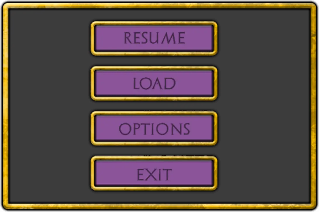
To simplify the design, maintain consistency, and optimize asset use, the in-game pause menu was reused from the title screen. By doing this, a single prefab and script could be created and used, across all levels.

Mobirise Website Builder
Early HUD for PC

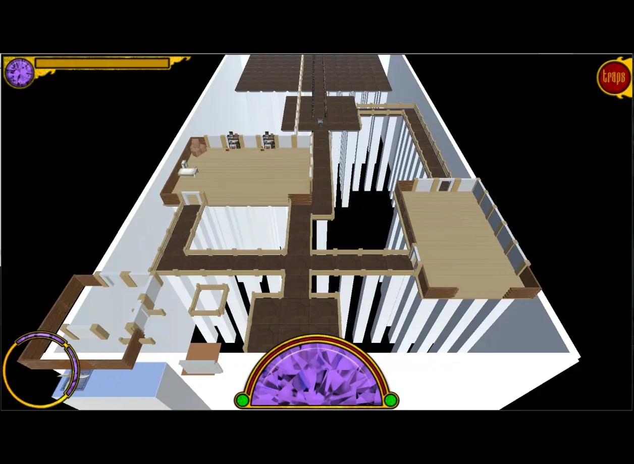
The HUD system went through 4 main design iterations, starting with a minimalist design, a highly stylized design, then to this design, made for our original PC concept. In this design, a combination of the stylized and minimalist designs, I decided the main focal point should be the turn button, as the PC build was to have less use of the HUD. The info panel in the bottom left corner remains transparent when not in use, to minimize screen clutter.

Mobirise Website Builder
Mobile Friendly HUD

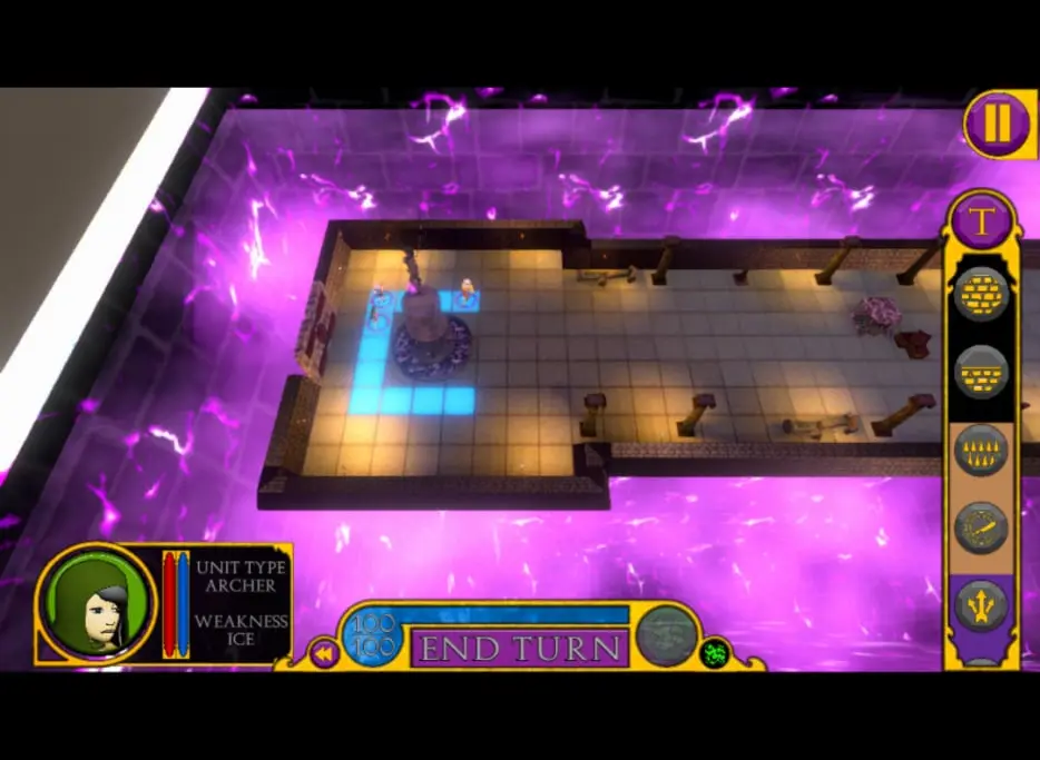
Once we made the decision to switch to a cross-platform game, focused on iOS based AR, I needed to shift my design style to allow full control from the HUD system, in a way that translated well to PC. To do this, the turn button and resource meter were merged, to further reduce clutter and provide room for tool tips. Also, dynamically controlled objects, like the trap and pause menus, were moved to the side of the screen with no camera or notch, while the left elements were positioned to accommodate phone's with screen notches.

Mobirise Website Builder
AR Camera

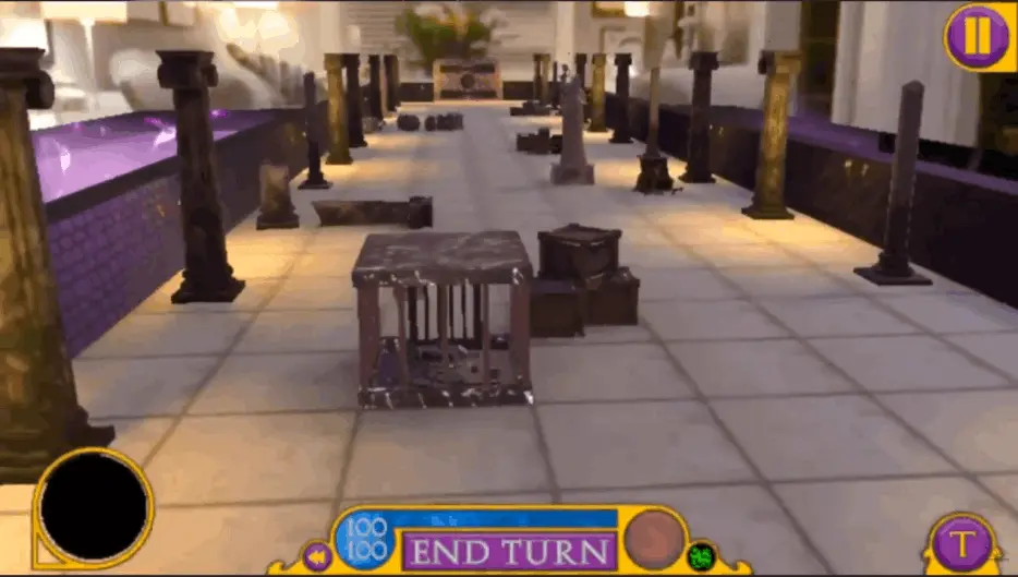
One of the pillars of my initial pitch for this game, concepted for PC, was the use of dynamic camera systems. It was this design choice and the public release of ARKit for iOS that influenced our decision to switch platforms. By doing this, animated cameras could be used for non-AR scenes, while also giving the player more control of the in-game camera than we could provide. Instead of a camera that zooms in to catch the action, then returns to the player's control, the player could get up close and personal with every part of the level, sprawled out on their coffee table.

Mobirise Website Builder
Loading Game Data

When loading the initial game data, I decided to use a more animated loading screen, featuring tips and little easter eggs, as we knew this would take longer than loading levels. This gives players amusement and something to look at, rather than a boring spinning wheel. The text uses a randomizer to display a different tip each time the scene is loaded, while the spinning logo is simply a pre-rendered video.

Mobirise Website Builder
Level Loading

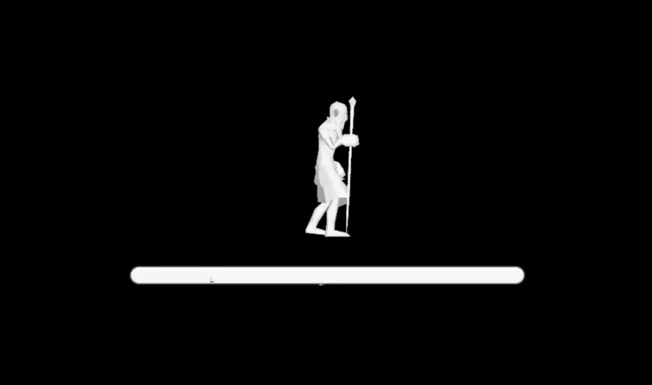
With scenes loading much faster than the initial game data, there was not enough time to read the tips on the previous loading screen, and we needed a way to track the level preload progress, without changing scenes. I designed and implemented this loading screen as a popup panel for tracking progress, while still providing some eye candy. The character is a 2D render of the untextured wizard character's walking animation, above a slider repurposed to track the level loading progress.

Mobirise Website Builder
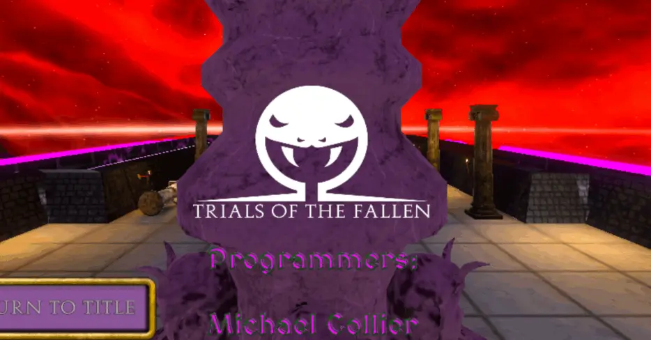
Roll the Credits

Similar to the Start menu, I designed and developed the credits scene using a combination of a 2D HUD panel, for the text and exit button, and an animated camera system. However, utilizing a pre-staged level and skybox for the scene, I built a level flythrough with Unity's Cart and Track system, showcasing characters, traps, and other game elements.
*Note: the credits in the demo use alternative joke roles for the dev team, as our titles were unofficial, with such a small team.

Mobirise Website Builder
Music & SFX

Late in the development stages of the game, I was asked to take over the Lead Sound Design roll, due to shifting team responsibilities. Armed with only a long list of requirements, including all in-game SFX, music loops, and unedited voice lines we received 3 days before our project deadline. In 48hrs, I designed, sourced, edited, and implemented over 70 individual tracks, to deliver the project on time.
*The playlist can be found HERE

Mobirise Website Builder
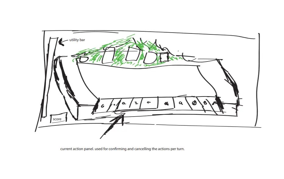
HUD Mockup

As the Lead UX Designer, maintaining our design documents was a large part of my job. This is an early mockup of a HUD feature for showing a list of the player's actions in the setup phase. Early in my design career, many of my flowcharts, wireframes, and mockups were hand drawn, either on paper or simple digital drawings like this. In more recent years, I have moved into using FIGMA and UML charts, as well as other PM and design software.

Mobirise Website Builder
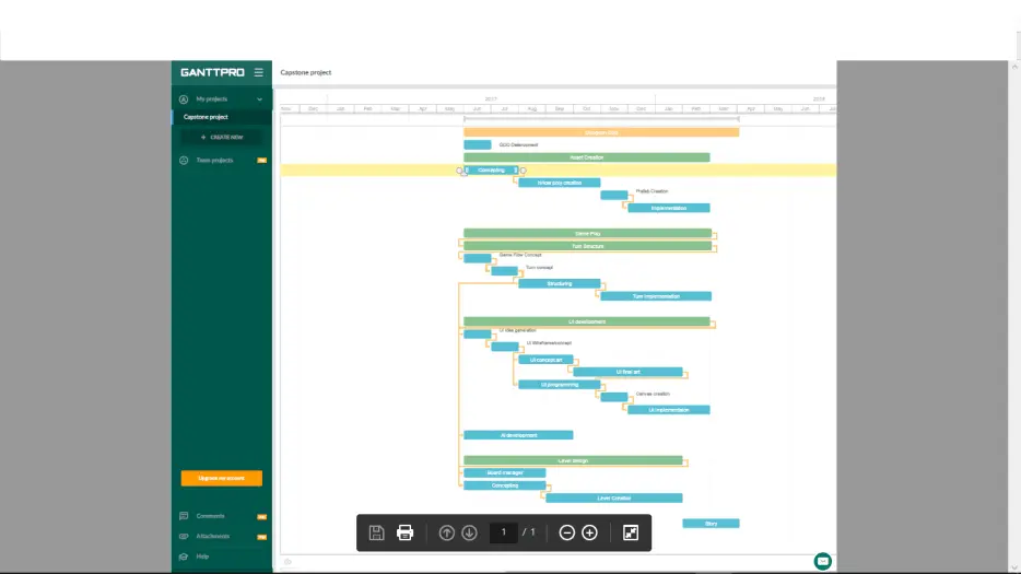
Gantt Chart

Because of my previous Project Management experience, I was tasked with creating, monitoring, and maintaining PM documents throughout the production lifecycle, including the project budget, UX flow charts, the above GANTT chart, Slack, and Trello boards. Later, when completing my BBA, I was able to use this experience to adapt the course content to apply to the game industry.

View Anthony in Action

Learn more about Anthony Armstrong and projects they've worked on

Anthony's Demo Reel

My TFS Alumni Ad

© Copyright 2021 Green Army Games. All Rights Reserved.

Designed with ‌

Mobirise's Offline Website Builder